About 100 minutes
A Guide to the Best Historical Novels and Tales — Inside the Classic
Fantasy Juvenile Worlds
22,970 recorded words. 11 minutes difference from this book's estimate.
View Gutenberg source #1359
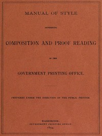
For Manual of Style Governing Composition and Proof Reading in the Government Printing Office — Background and Themes, the stored edition analysis reports 20,255 words, 1 hr 29 min estimated reading time, and 4 detected text sections.
The text analysis averages about 13.3 words per sentence, while the detected sections provide another way to judge how the source is divided.
Project Gutenberg metadata also associates the work with “Proofreading,” connecting these edition facts with the source record’s subject description.
Explore this collection
These alternatives are selected using recorded categories and estimated reading time.
About 100 minutes
Fantasy Juvenile Worlds
22,970 recorded words. 11 minutes difference from this book's estimate.
View Gutenberg source #1359About 100 minutes
Fantasy Juvenile Worlds
22,821 recorded words. 11 minutes difference from this book's estimate.
View Gutenberg source #16844About 115 minutes
Fantasy Juvenile Worlds
26,236 recorded words. 26 minutes difference from this book's estimate.
View Gutenberg source #4001Search stored excerpts and compare books → Choose by your preferences →
Choices use stored catalog measurements. Estimates vary with reading speed. A shared category is a catalog label, not a claim that two books have the same argument or literary quality.
Search reads excerpt text stored with this catalog and links to its associated Gutenberg record. The connection is stored in the site database; this tool does not recheck that every excerpt is word-for-word identical to that external record. Excerpt search does not cover every chapter and does not verify historical publication dates.
Catalog snapshot checked: 2026-09-25. Coverage: 92 public books, 92 available source excerpts.
Read the complete public-domain text at its original source.
Read on Project GutenbergThe Manual of Style Governing Composition and Proof Reading in the Government Printing Office, issued in 1894, is a rulebook for the mechanics of official printing. Its preface states that “clear and positive rules” are needed to “prevent confusion and unnecessary delay and expense.” The manual addresses compositors, proofreaders, and department editors, offering instructions on everything from the spacing of Indian names to the proper form for Congressional case numbers. It treats typography as a matter of administrative efficiency, not aesthetic choice.
The manual’s rules for punctuation and capitalization are not arbitrary but serve to standardize legal and governmental documents. For example, it specifies that “Congressional, No. 25” and “Congressional case No. 25” are distinct forms, each with a prescribed capitalization pattern. Similarly, it dictates that “first session Fifty-third Congress” should be set without a capital on “session” but with a capital on “Fifty-third.” These choices reflect a hierarchy where official titles and numbers are emphasized, while common nouns are subordinated. The manual also prescribes the use of periods after addresses at the head of communications, as in “Hon. Amos J. Cummings, House of Representatives.” Such rules ensure that every document follows a uniform pattern, reducing ambiguity in official correspondence.
The manual devotes a section to tabular work, where the arrangement of figures and text must be exact. It instructs that “en quads” be used in cap and small-cap lines in addresses and signatures, and that “a proportionate increase of space” be applied in heads of extended type. For indexes, it details how to handle overrunning folios: “retain only the first folio number in the leader line” and indent evenly “not less than seven ems on the left.” These instructions reveal a concern for visual clarity and economy of space. The manual also specifies the use of “two leads before footnotes in all cases” and the separation of extracts in solid matter by “two leads” or “three leads” in leaded matter. Every measurement is quantified, from the number of asterisks in a “line of stars” (seven in full measure, five in briefs) to the spacing of consecutive years (1875–76 vs. 1875–1879).
The manual’s “Suggestions for compositors, readers, and revisers” outlines a workflow where errors are caught through multiple stages. It advises that “typewritten copy is always preferable” and that “plain copy is absolutely essential to good work.” Authors are told to “so prepare their copy that it can be clearly understood by the printer” and to give it “as careful revision as is afterwards given proof sheets.” The manual also includes specific prohibitions: “Never divide a word in a headline if it can possibly be avoided,” and “avoid… the use of a dash at the beginning of a line, two-letter divisions, and the repetition of divisions at the end of three or more contiguous lines.” These rules aim to prevent typographic disruptions that could slow reading or cause misinterpretation. The system is designed for efficiency, with the goal of “measurable perfection” through standardized procedures.
This manual is best read as a historical artifact of bureaucratic communication. Its rules reveal how the U.S. government sought to impose order on the printed word, treating typography as a tool for clarity and consistency. Readers interested in the history of publishing, administrative language, or the material culture of documents will find it a rich source of specific, rule-bound practices.
There’s a strange comfort in these old rules—how a comma had to sit, how a table must breathe. It makes me think of other quiet catalogs, like this Bohemian (Cech) Bibliography A finding list of writings in English relating to Bohemia and the Cechs — Story, Setting & Ideas, a list of long-gone voices, each waiting patiently to be remembered again.
Save your reaction, strongest insight, and memorable passage.